Exploring the Power of Flexbox: Revolutionizing Your CSS Layouts
Flexbox, short for the Flexible Box Layout, is a powerful CSS layout module that enables developers to create dynamic and responsive layouts with ease. This innovative approach to web design revolutionizes how we manage space distribution and alignment of elements within a container. Unlike traditional layouts that use floats or positioning, Flexbox allows for more intuitive design patterns, accommodating a variety of screen sizes seamlessly. By utilizing properties such as display: flex, flex-direction, and justify-content, developers can efficiently control layout orientations and alignments without the pitfalls commonly associated with older CSS methods.
One of the standout features of Flexbox is its ability to adapt to different screen sizes and orientations. This flexibility is crucial in today's mobile-centric world, where ensuring a smooth user experience across devices is paramount. Developers can easily create responsive navbars, card layouts, and grid systems by leveraging Flexbox properties. For instance, by employing align-items and flex-wrap, designers can effortlessly manage how items respond to the available space, making the layout not only visually appealing but also functional. As we continue to explore the power of Flexbox, it becomes clear that it is an indispensable tool for modern web development.
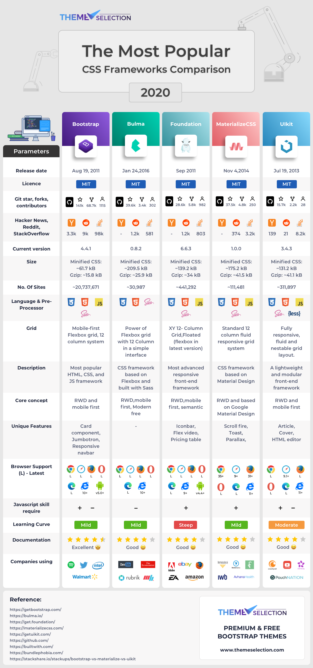
Top 10 CSS Frameworks You Need to Know in 2023
As web development evolves, utilizing the right tools is crucial for creating modern, responsive websites. In 2023, there are several CSS frameworks that stand out for their features and community support. Frameworks like Bootstrap and Tailwind CSS continue to dominate the landscape, offering extensive libraries that streamline the design process. Here’s a look at the top 10 CSS frameworks you need to know this year:
- Bootstrap - A classic choice known for its grid system and responsive design features.
- Tailwind CSS - A utility-first framework that promotes rapid prototyping and customization.
- Foundation - Developed by ZURB, it focuses on mobile-first design and accessibility.
- Bulma - A modern CSS framework based on Flexbox, providing a simple grid system.
- Semantic UI - Emphasizes human-friendly HTML with clarity and simplicity.
- UIkit - Offers a modular approach for component-based design.
- Materialize - A responsive front-end framework based on Material Design principles.
- Milligram - A minimalist framework that provides a clean and simple starting point.
- Skeleton - A lightweight framework for responsive design that is easy to use for small projects.
- Pure.css - A set of small, responsive CSS modules that can be used in any web project.
Common CSS Pitfalls: How to Avoid Them in Your Styling Strategies
When it comes to CSS, common pitfalls can significantly hinder the performance and appearance of your website. One of the most pervasive issues is the misuse of CSS specificity. It's crucial to understand how the cascade works and to avoid overly complex selectors, which can lead to unexpected results and make your styles hard to manage. A helpful strategy is to use class selectors whenever possible, as they provide a good balance between specificity and maintainability. Organizing your CSS in a modular fashion, perhaps using methodologies like BEM (Block Element Modifier), can also help prevent conflicts and ensure your styles are applied as expected.
Another frequent mistake is neglecting browser compatibility and responsive design. Always remember to use vendor prefixes and test your styles across different browsers to ensure a consistent experience for all users. Additionally, failing to implement media queries for varying screen sizes can result in a poor user interface, especially on mobile devices. By adopting a mobile-first approach and regularly checking your design's responsiveness, you can avoid these CSS pitfalls and create a more engaging and accessible site. Embracing these strategies will not only enhance your styling techniques but also improve the overall user experience.